
Photo credit: Publix.
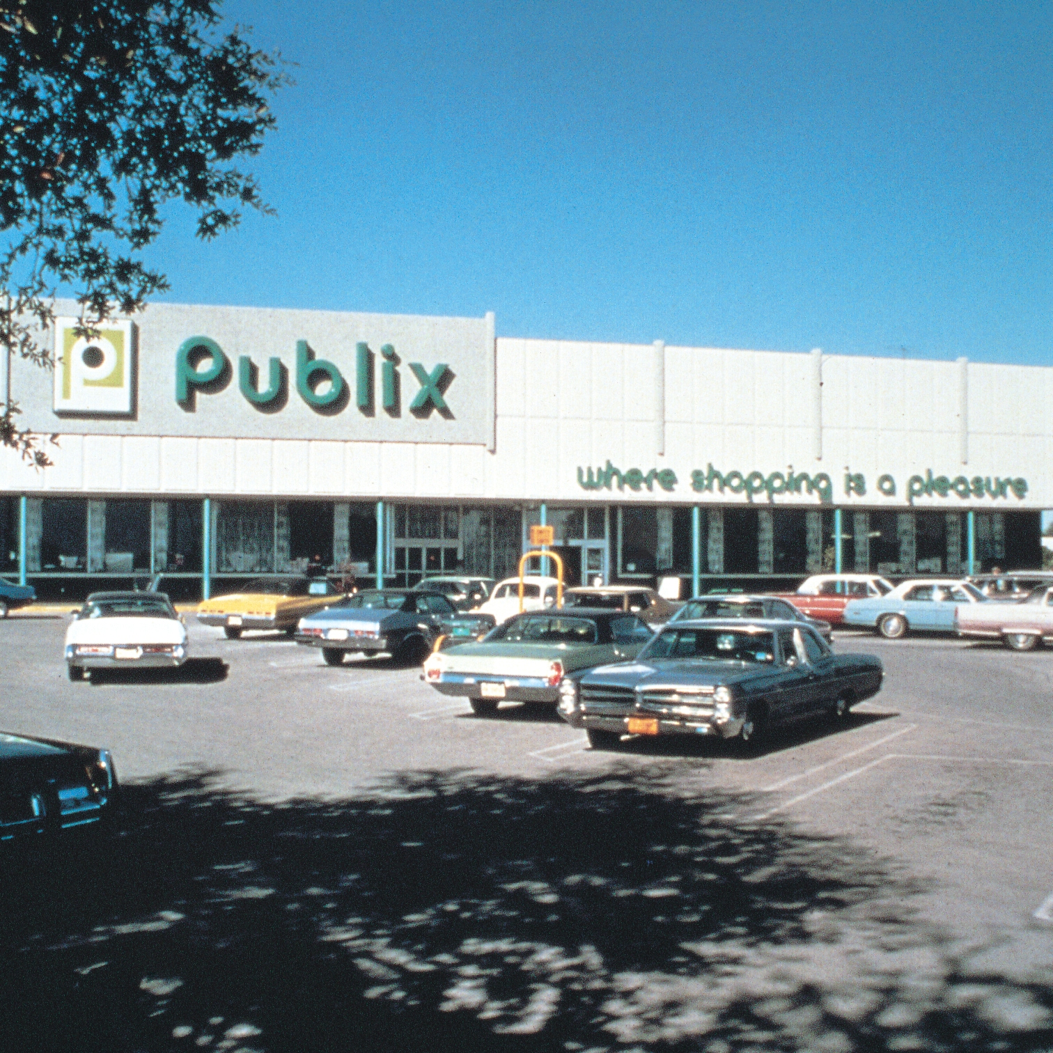
Publix has always been a leader in customer satisfaction, setting high standards not only in service but also in the architectural design of its stores. Whether it’s the deli team remembering your order each week, the bagger walking your items to your car as they sincerely ask you how your family is doing, or the inviting layouts that stay properly organized for shopping convenience—Publix has never strayed from their slogan.
In fact, George Jenkins (founder of the shopping giant) said, “This isn’t something we dreamed up out of blue sky and white Florida sand. It’s a philosophy that has guided all our decisions and policies ever since we opened our first food store…we have tried to make good and sure that nothing stands in the way of making that slogan a reality for each and every one of our customers.”
Photo credit: Publix
For 90 years the brand has made sure they are connecting with their audience through continuous design evolutions both architecturally and services. With the first store opening in 1930, Jenkins set his own vision to stand out above the other retail grocers through quality service, top employees, the best of the best for the atmosphere itself. He wanted the finest for his customers which started his first slogan, “Florida’s Finest Food Stores.”
Movies and Lights
Publix’s most iconic location is from the 1950s. Still standing today, this store was featured in the 1990 film Edward Scissorhands.
While the film industry caught the attention of the brand’s design, it wasn’t until the 1960s when the spotlight went from the screen to the store’s facade. The original art deco architecture was in need of a facelift. This task was given to one of Florida’s most renown architects, Donovan Dean, who created the retail store’s winged design that shone bright at the entrance. With neon lights taking center stage in this design, the added touch was the blinking motion of these lights as customers and employees entered and left the building. The effect made an illusion of a waterfall and set the chain apart in a dramatic way.
Photo credit: Publix.
Fixer Upper – Publix Style
With the retail grocer’s exterior facelifts in action, interior upgrades came later. During this time of growth, even to new states outside of Florida, the design team switched up the color scheme to included corals and teals.
But colors were not the only thing changing. Publix added in new designs to showoff their organic line of goods, GreenWise. The hope was to make the organic purchases more attractive to the customers as they walked through the already existing store sections. The stores then worked towards adding in full service pharmacy’s that would allow more than shopping for food a pleasure. Even finding locations that could accommodate additional space to form cafe eateries and liquor stores, Publix knew they would need to constantly evolve to keep their shopping experience above the rest. The early 2000s allowed for these opportunities, but even today, the retail giant is in a constant state of re-design. Addressing the desires of shoppers has always been Publix’s focus. Elevating the shopping experience as a whole is what drives some of their design enhancements. Whether it’s an olive bar, burrito bar, full-service pharmacy or a cafe to enjoy the store’s offerings, Publix is there to ensure the entire experience is a pleasure.