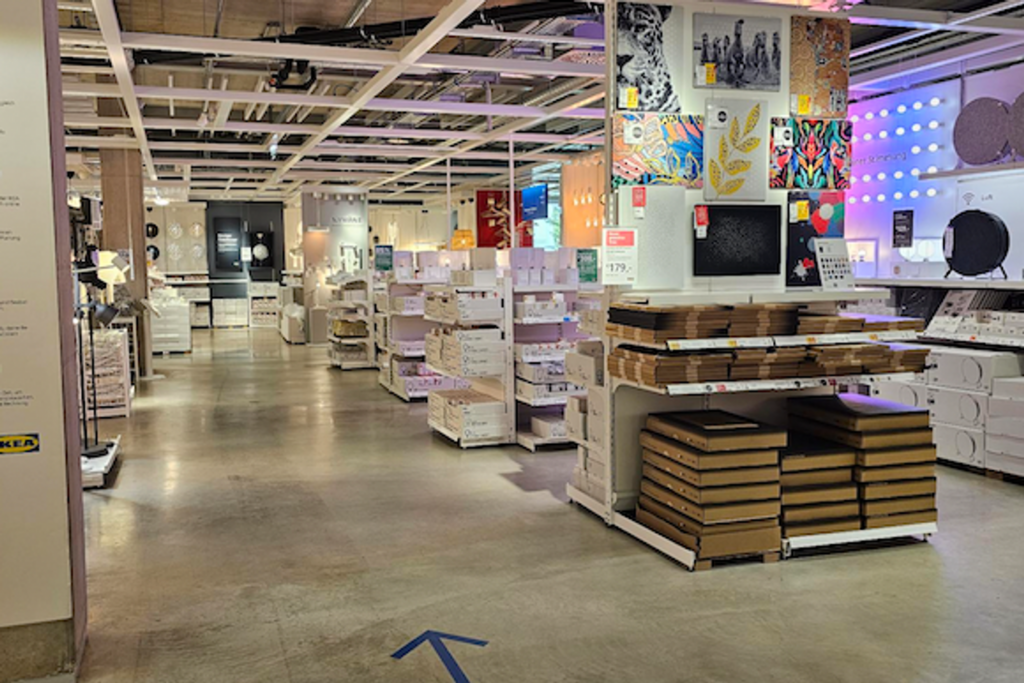
As architectural designers who truly cut our teeth in the retail field, we were tickled to read a story about Swedish retailer IKEA trying to eliminate a core element of their design–and the backlash that followed from loyal customers.
Typically, retail stores are designed with two things in mind: efficiency and opportunities to introduce unexpected products to shoppers who might have come into the store with something else in mind. End caps and attractive displays near checkout are notorious for catching a shopper’s eye and luring them into impulse purchases.
IKEA has always taken that principle of distraction and attraction to heart through the iconic maze layout of their massive stores. The first IKEA was created in Sweden and opened in 1965 with 500,000 square feet–the largest furniture store in Europe at the time. The looping design of the flagship was partially modeled on New York’s Guggenheim museum–and ultimately inspired the meandering vibe IKEA would continue to pursue around the world.
“The store’s throughway systems that make customers walk around showroom after showroom were originally designed to usher customers through a real-life version of the IKEA catalog…” (SOURCE). It is a maze that literally makes 3-D advertisements that can immerse shoppers in a space they can easily imagine implementing at home.
As IKEA has looked to grow its inner city models, the large format stores weren’t possible and they tried to consider the divergent needs of city dwellers with smaller spaces. IKEA executives thought casual shoppers and office workers would prefer more of a department store style feel with like items paired together. They thought it would make shoppers spend less time in the store and be able to pop in without long sojourns through a meandering store.
However, customers came to equate the IKEA brand with the store design of curated room displays and preferred the wandering designs. They didn’t like the new concept and were vocal about it! With increasing data in hand from surveys and interviews, IKEA changed the new concept and created a “whittled-down” version of the maze for its smaller operations. Since making the change, sales are already rising on the reconfigured stores.
This IKEA tale is brimming with case study lessons and design notes for all retail operations, and we certainly have taken note at COR3.
